Brand Strategy, Identity Design, Digital Audit, Graphic Design
How do you use thoughtful design to bring trust and satisfaction to an experience traditionally synonymous with discomfort?
Background
People are scared of the dentist. This has been true ever since dentistry has been around. Scientific research has attributed Dental Fear and Anxiety (DFA) to everything ranging from past experiences, role models and the media to genetics, personality and intelligence.
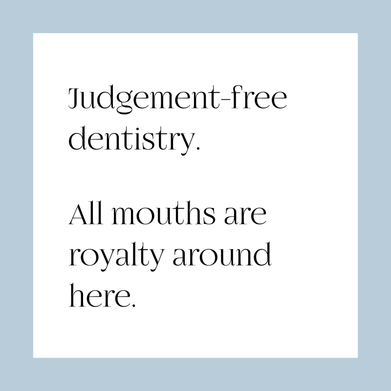
Our project was aimed at changing what we could control – the perception of the dental experience. Dodo makes each ‘member’ (not ‘patient’) feel like they are Dodo’s only member. Everything that you can see, touch, smell or hear at Dodo is carefully designed and set in place to make the dental experience as fun and as comfortable as possible.
Dental treatments can sometimes hurt, there is no way around that. Our branding seeks to flip the overall dental experience into an enjoyable one by neutralizing the anxiety caused by the thought of pain.
An identity system based on the familiar four incisors that lead the show
The upper front four teeth (maxillary central and lateral incisors) are the most visible human teeth. They are the familiar four teeth that greet you in the mirror every morning. They are the main representatives of every great smile and the commanders of your army of pearly whites. Dodo’s wordmark logo traces the outline of these four teeth. This is in contrast to the go-to logo of the dental industry – the uprooted molar (ouch!). Our wordmark-based identity has been carried over to all other brand applications and works seamlessly with all the other brand elements.
Dentistry with soul: an experience designed to impress
Every element of the Dodo brand seeks to relax and comfort based on three brand pillars we developed during our service study:
Create a space that is a sensory sanctuary.
Build radical transparency and partnership.
Empower each member with agency.
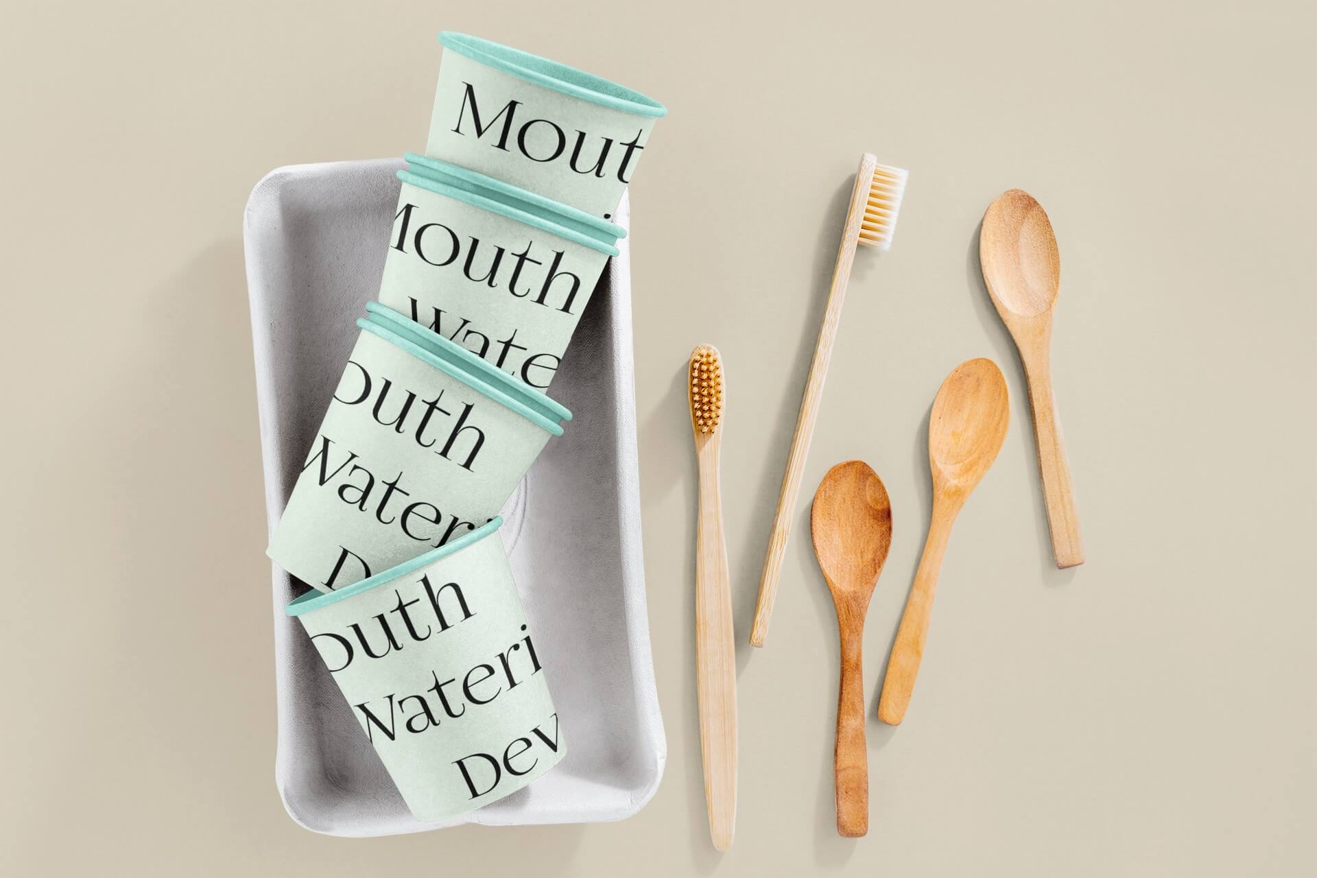
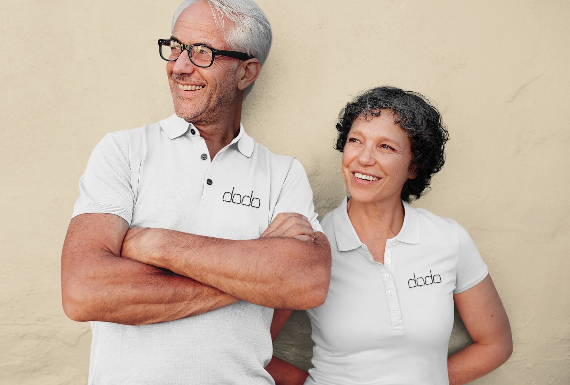
The staff at dodo are courteous, respectful and empathetic. The brand colors are purposely desaturated to help the mind calm down and prevent feelings of anxious excitement. Everything from social posts to the studio interior design is based on this palette. The brand tone of voice is friendly, fun and approachable. Through the brand photography, we present regular people with regular mouths having fun, being silly and being relatable. Smells are registered in memory vividly; a signature sandalwood-based scent (exotic, woody and smooth) was also set for use in the studio to form the olfactory wing of our brand identity system.