Trackd
Industry
Enterprise Cybersecurity
Services
Brand Discovery, Identity Design, Digital Design, Graphic Design


How can a new cybersecurity startup revitalize the confused world of Vulnerability Management?
Background
Vulnerability Management has a problem—it is highly complex to ensure that applying a security patch won’t cause unintended disruptions elsewhere in the system. This often discourages remediation teams from applying critical security patches on time, leaving their company’s cyber assets wide open to opportunistic threat actors.
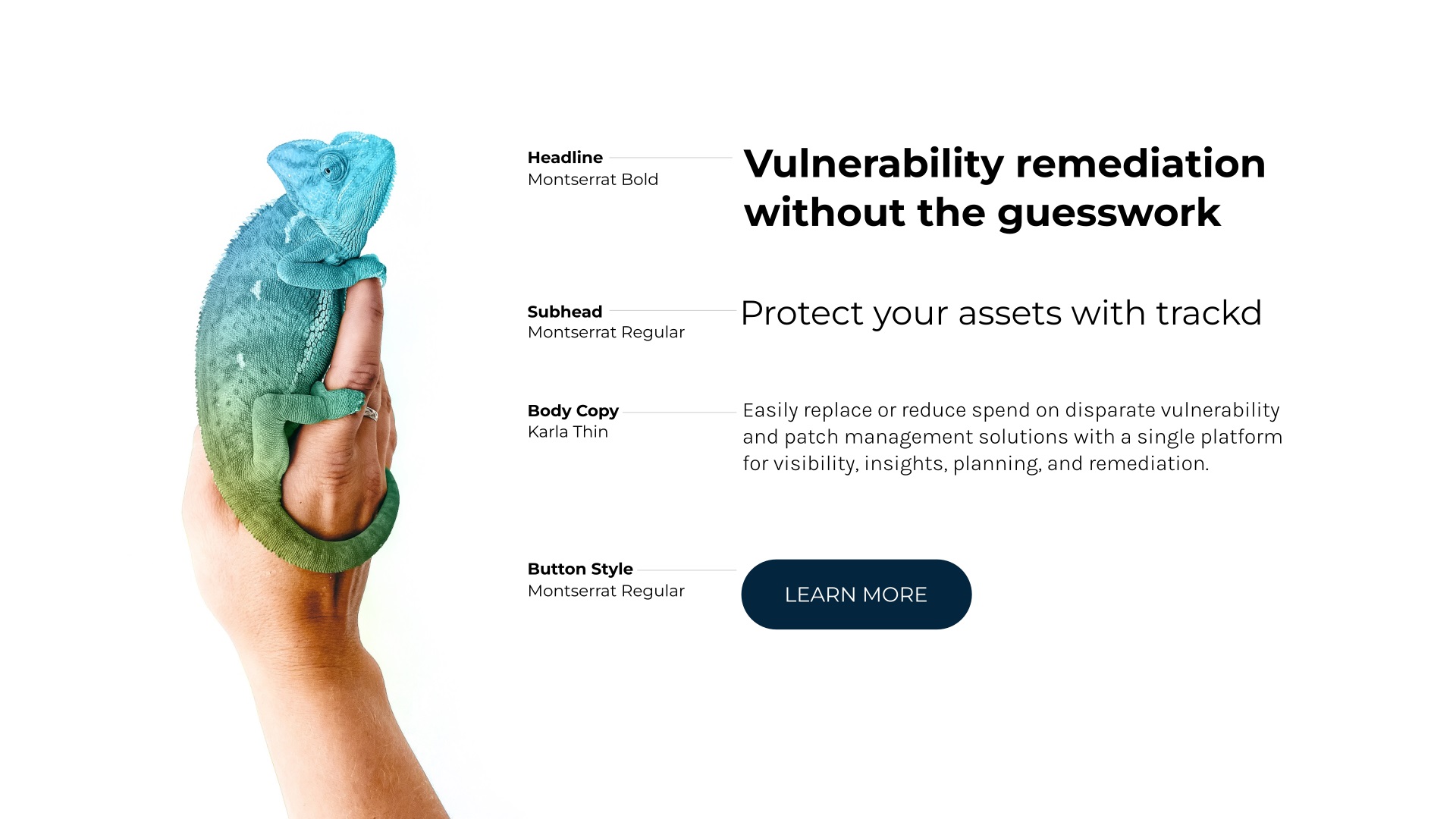
Enter Trackd, a DC-based startup that removes the guesswork from patching by providing real-time AI-based insights into how each patch has historically impacted other systems. Trackd’s intelligent vulnerability remediation platform helps security teams access crucial security insights and patch much faster, without the fear of service disruption.

The Visual Identity
Brands of Earth worked closely with Trackd founder and CEO Mike Starr and his team to create the Trackd visual identity and website. According to Mike, the market has been “so extremely jaded against tangible positive improvement as a result of being promised great innovation yet being constantly let down for the last thirty years”. Our discovery exercises revealed that Trackd’s major differentiation is their focus on the fundamental bottleneck of Vulnerability Management—humans. In an industry riddled with complex, tech-heavy systems, the Trackd platform is designed to be intuitive with disruption-minimizing tools that seamlessly integrate into remediation workflows.
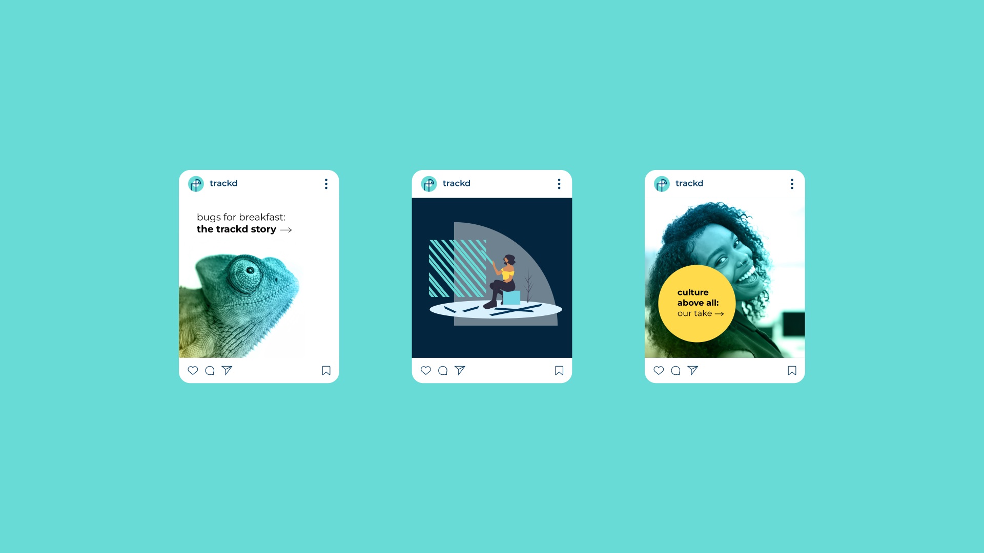
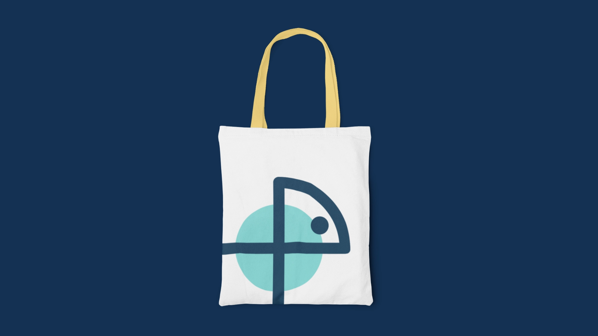
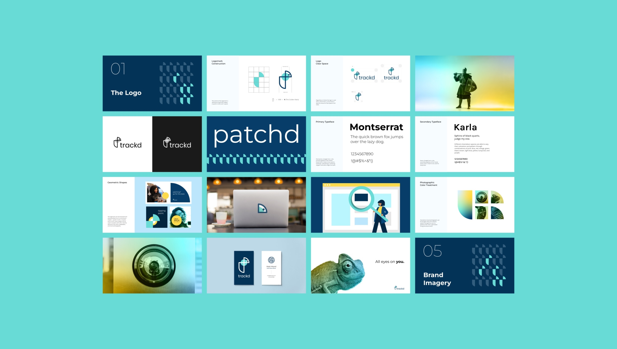
Our design journey for Trackd was driven by a commitment to infuse approachability into every element of its visual identity. We’ve veered away from dreary corporate symbols and colors and have sought to inject vigor and subtle irreverence into the design. The brand mascot is the chameleon symbolizing constant vigilance, transparency, and 360 degrees of oversight. The logomark is an amalgamation of the chameleon symbol, the letter T, a shield (symbolizing Trackd’s defensive capabilities), and a scope (symbolizing offensive capabilities). The brand color palette consists of two shades of blue, Trackd Turquoise and Patch Navy with white and an accent yellow being utilized for balance. The new look for Trackd extends through the applications, including brand graphics, stationery, signage, social media, and the website. Overall, the identity encapsulates Trackd’s holistic and very human approach to ‘removing the guesswork out of vulnerability remediation’.


Stream of consciousness from the Trackd team
“The product provides: utility, reliability, reassurance, quality and emphasizes: understated elegance, strength; whereas, the company emphasizes: integrity, self-reliance, clarity, engagement, competence (competence implying “upbeat, witty, intelligent, playful,” where technology can be rewarding and human, rather than in the corporate-and-soulless sense of competence) … Reminds me of your friend’s dad with a nice mustache who can somehow do gymnastics and also archery and as a kid you’re like “woah, what?””


The Trackd website: uniting form and function
We developed the Trackd website, marrying the themes of the visual identity with a simple and functional user experience. The design process started with a wireframe that illustrated the general form, layout and interface of the pages and content areas. Following this, we built prototypes to simulate the actual look and feel of the site on desktop and mobile devices. Finally, we developed the mobile-optimized site, with careful consideration to speed, security and SEO best practices.


Industry
Health & Wellness

