Sina
Laboratories
Industry
Health & Wellness
Services
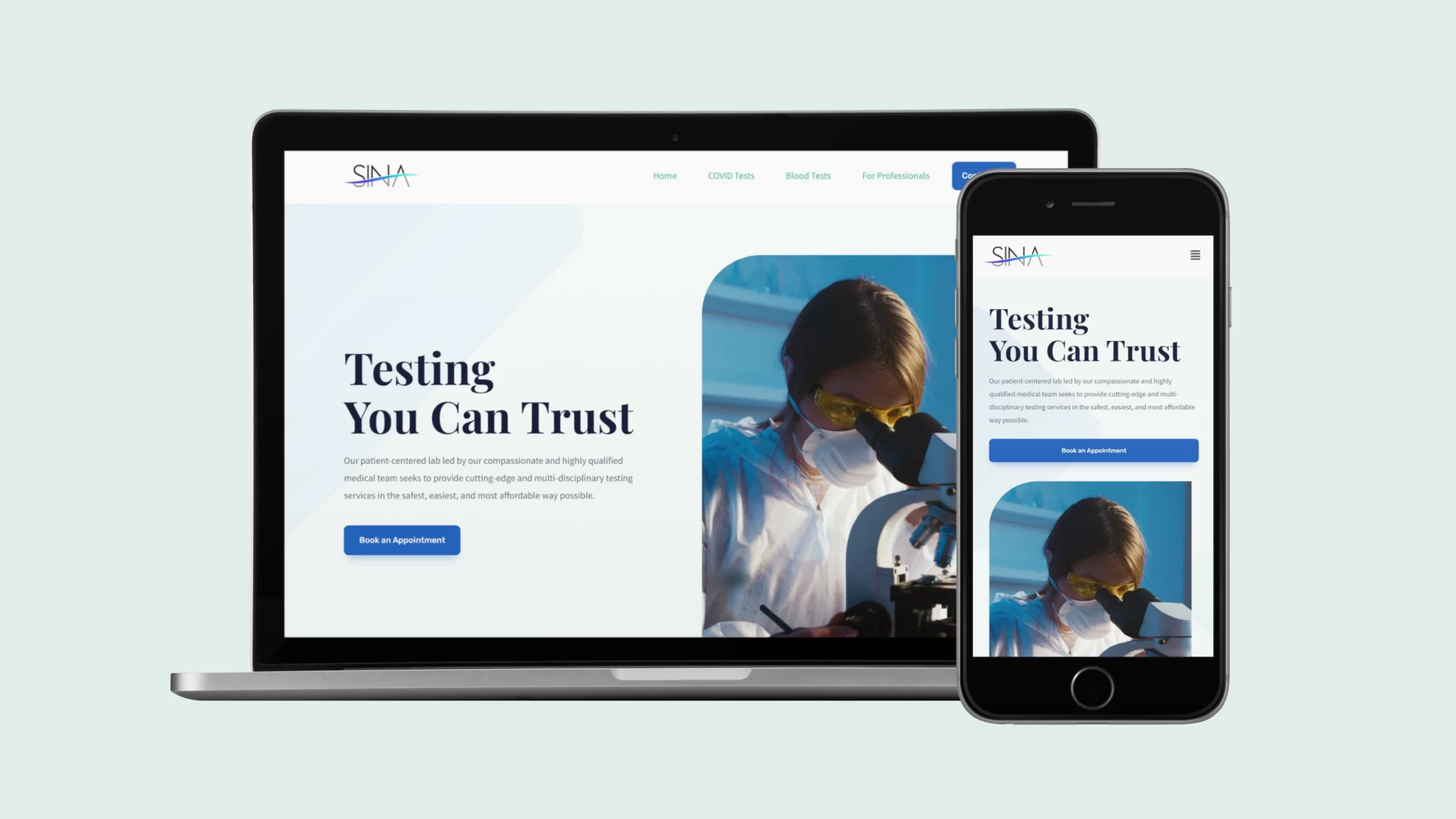

Making high-quality health testing available to everyone, and making everyone want it
Background
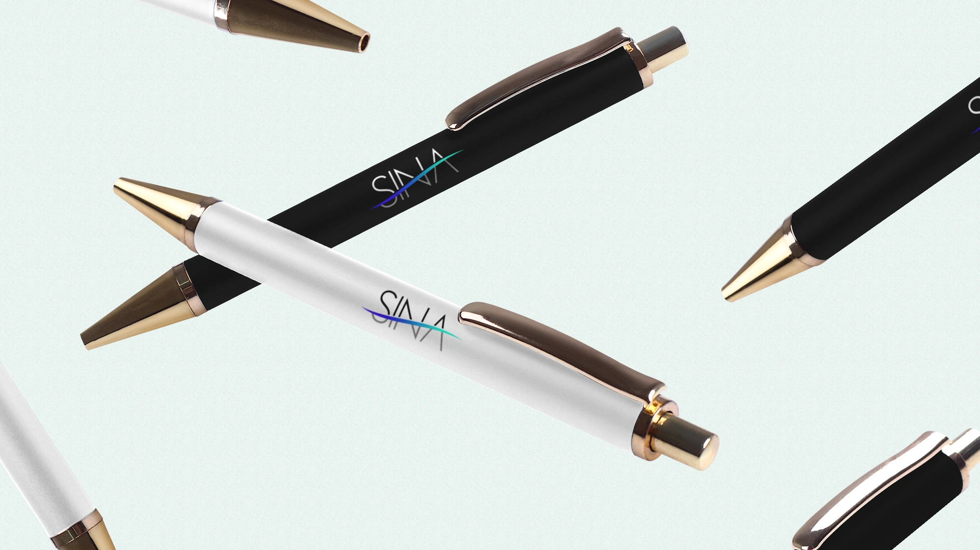
We worked with the founders of Sina Laboratories, Asheville to develop a new logo and a website for their business. Sina is a multi-disciplinary diagnostic lab that provides premium testing services at affordable prices. The polished new logo and website positions Sina as a modern and state-of-the-art lab. The new identity comes in multiple avatars to suit multiple brand applications, for now and for the future.



Minimal and Sleek
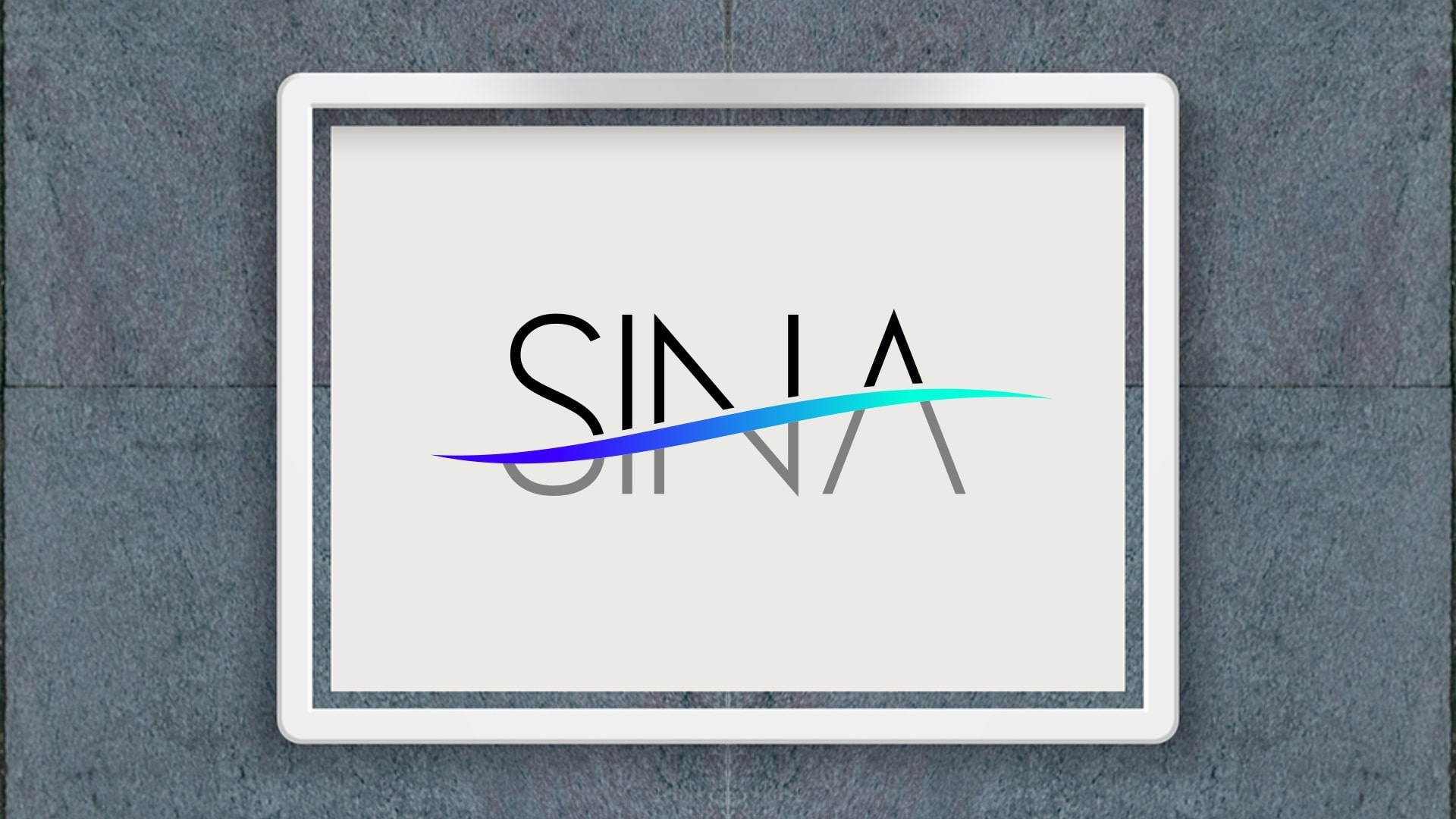
The typeface is hyper-minimal. The graphic element that runs across the wordmark draws inspiration from the structure of human non-striated muscle fibers and appears to ascend from left to right. This suggests Sina’s role in helping patients ascend from weakness, ill-health and low points in life to strength, wellness and self-transcendence.
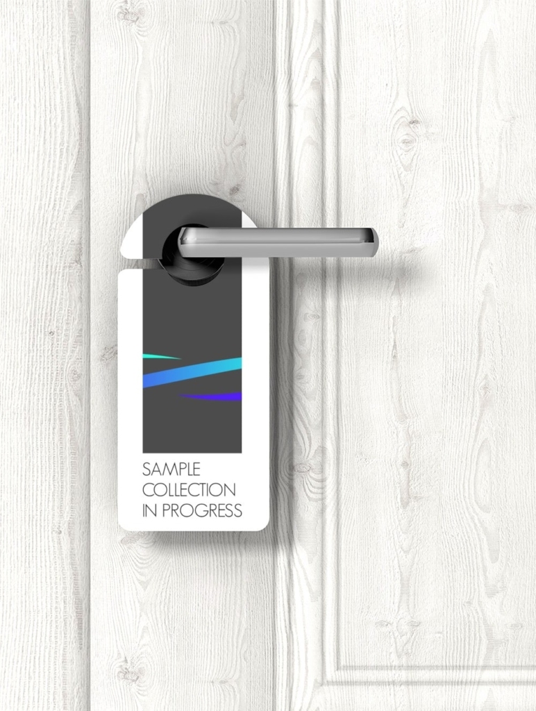
The logo comes in its primary form with a beautiful blue-green color gradient. Its alternate dark, light and submark forms provide versatility in branding. Together, these marks accommodate a wide range of present and future brand applications, for screen and for print.
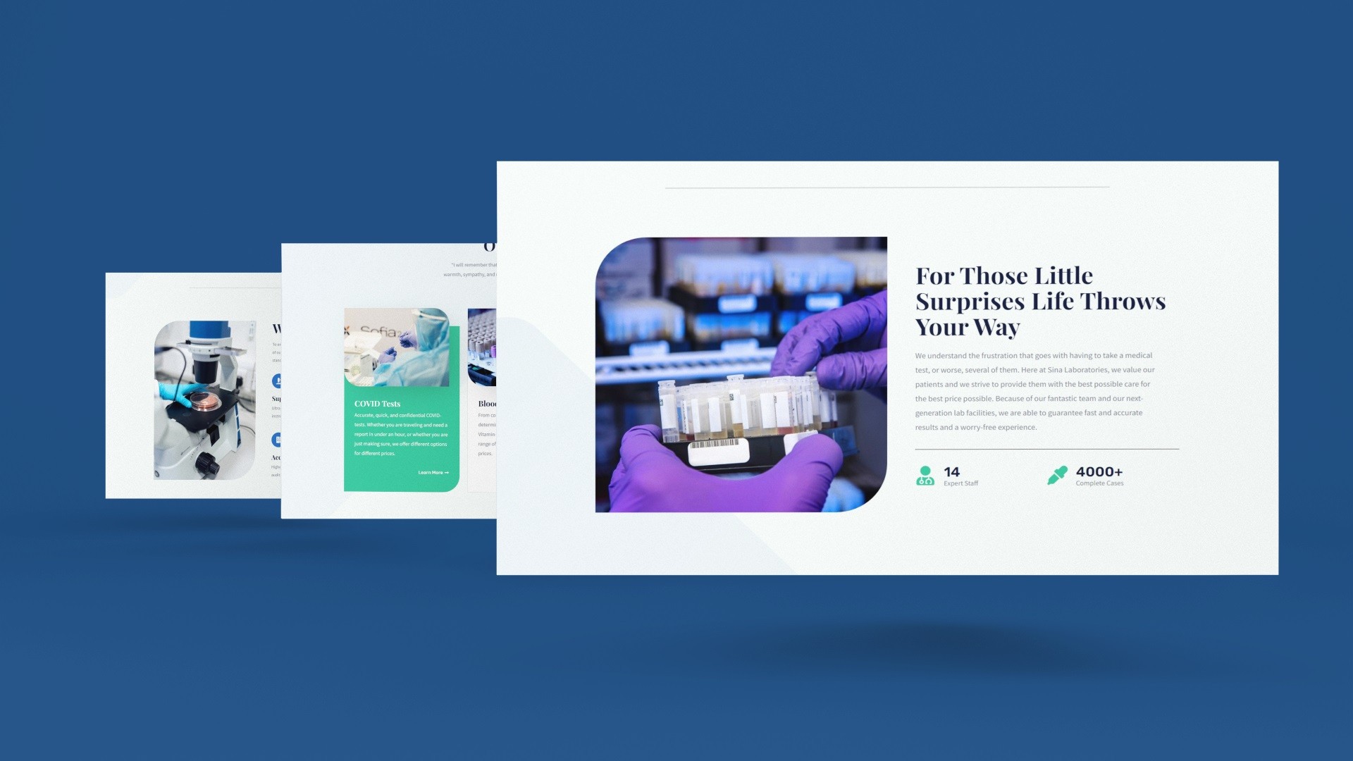

A clean new website to accompany the clean new identity
We helped Sina with the domain purchase, hosting set-up, SSL certificate installation, and website development. The new mobile-friendly website is as sleek as the new logo and as efficient as the business it represents – from compressed WebP images to decrease page sizes and load speeds, to proper caching and page optimizations to improve SEO.


Industry
Utilities & Construction

