Huscan
Industry
Business Consulting
Services


Star guide: How can we enable a consulting firm to illuminate the path for its confused clients?
Background
Huscan is an ecommerce consulting startup that helps small businesses with limited resources build sustainable and resilient supply chains amid churning markets, global crises, and general turbulence.
We worked with the Huscan founders to craft a brand identity that would communicate the approachability of Huscan’s amazing team while exuding the gravitas of a global brand that means business. The vibrant new identity helps Huscan’s audience feel welcome and reassures its clients that they are in good hands.
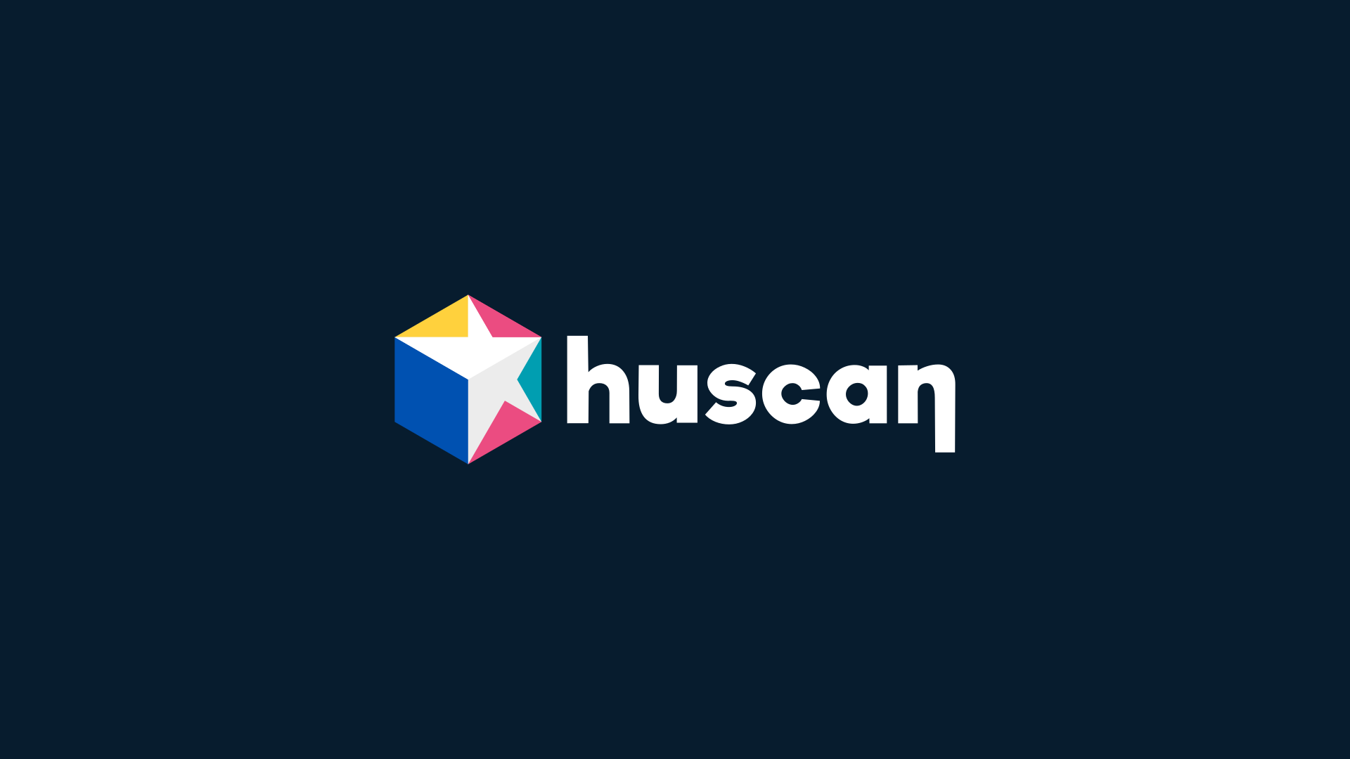

The Huscan mark is engineered to be symbolically rich
The logomark portrays an angled box wrapped in the brand colors, which in two dimensions forms an aesthetically sound hexagon. The box symbolizes the ever-moving package that is the basic building block of the supply chain industry. The colors are wrapped around the box like wrapping paper in such a way that the negative space forms a star. The star, in addition to being the universal symbol for excellence, depicts the North Star, which guides navigators and travelers to their destinations, the same way Huscan guides its clients to theirs. The stylized h and n of the Huscan wordmark symbolize the path of inflow and outflow of goods, respectively.
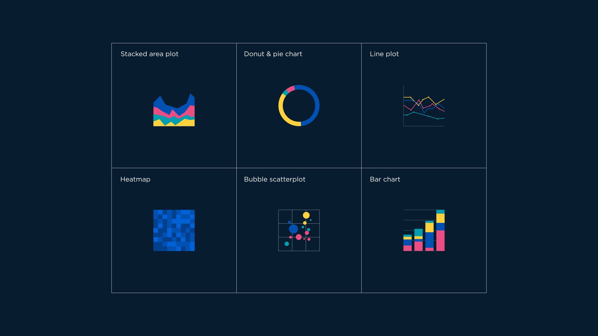
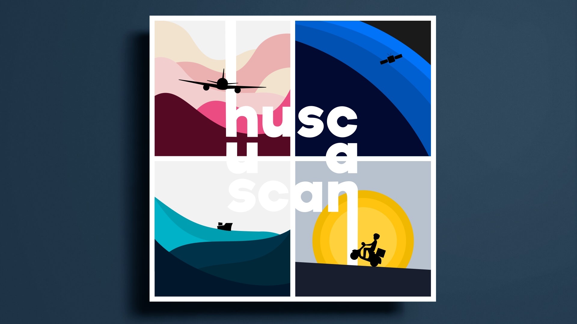


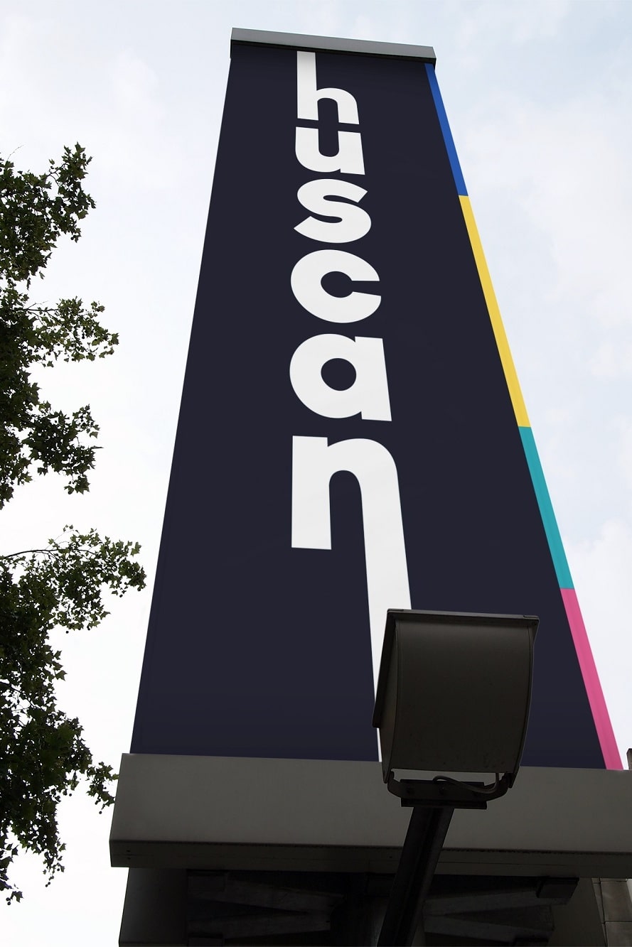
Versatile and vibrant, on screen and in print
The identity system needed to convey the precision of Huscan’s proprietary technological capabilities and extensive domain knowledge, along with the vibrancy and warmth of its fantastic global team. The rapid growth of the business also meant that the identity system needed to be compatible with a wide range of applications in all sizes, digitally and in print. The final system is complete with multiple assets that can be mixed and matched for any brand application.


Industry
Health & Wellness
