A bold and confident new identity that presents Eastmile Electrical as the go-to, global-standard local electricians.
Background
Eastmile Electrical is an electrical business in Albany, New York, founded in 2003. They specialize in residential, commercial, and industrial electrical work. The founders decided that the mark they had been using since 2003 was outdated and required a makeover. This is where we came in. In addition to building their new primary logo, we built Eastmile Electrical a comprehensive identity system and a website that is an extension of this identity. Eastmile’s new look brings the business into the 2020s and helps them stand out boldly and brightly in their community.
The Visual Identity
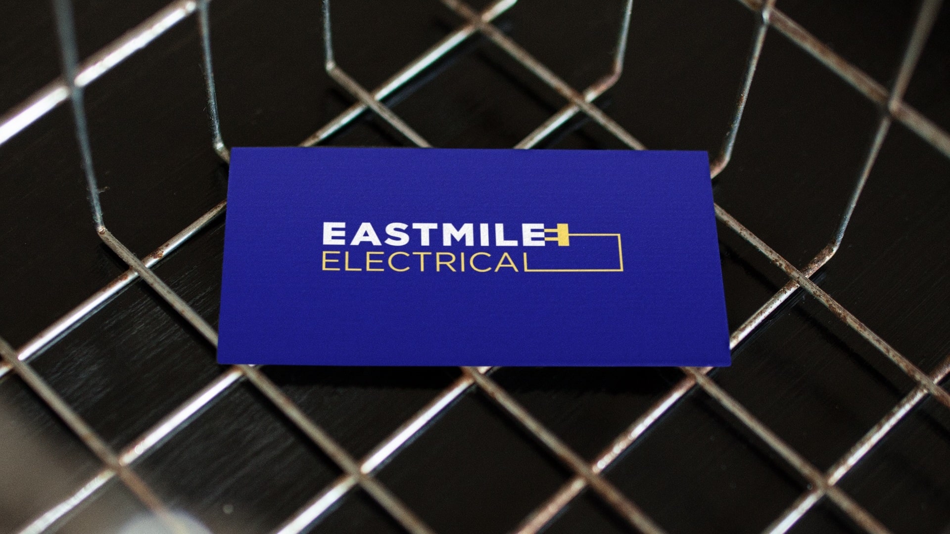
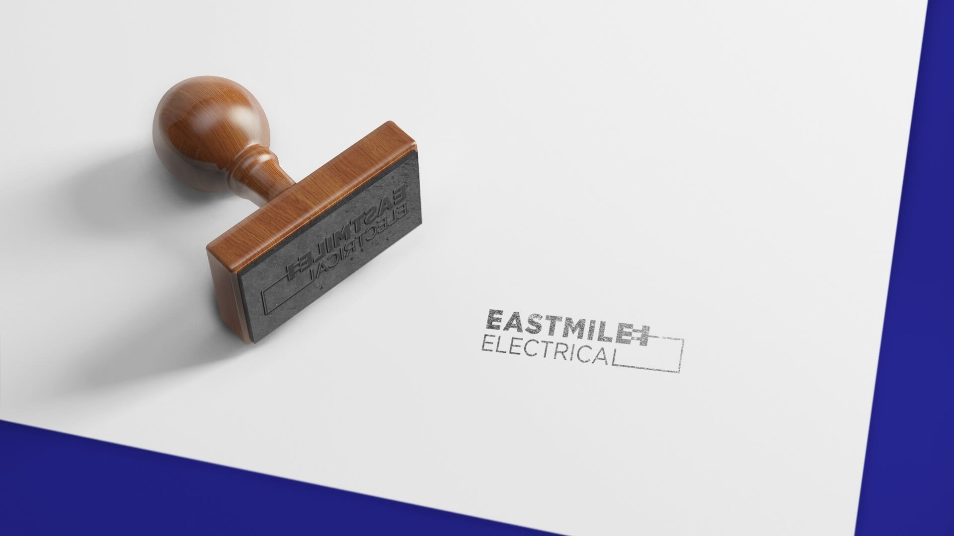
The minimal sans-serif logo combined with the new modified color palette suggests modernity and professionalism. The wiring and power plug have been carried over from the old identity to the new one in a cleaner and mildly more amusing fashion with the plug positioned at the E in such a way that the E forms the socket. The wiring graphic element in the logo also doubles as a symbol for ‘Eastmile’, with the rectangular shape at the right side of the mark denoting a mile at the east side. The wiring, plug, and socket serve as unique identity elements and are used throughout the identity system in various combinations.
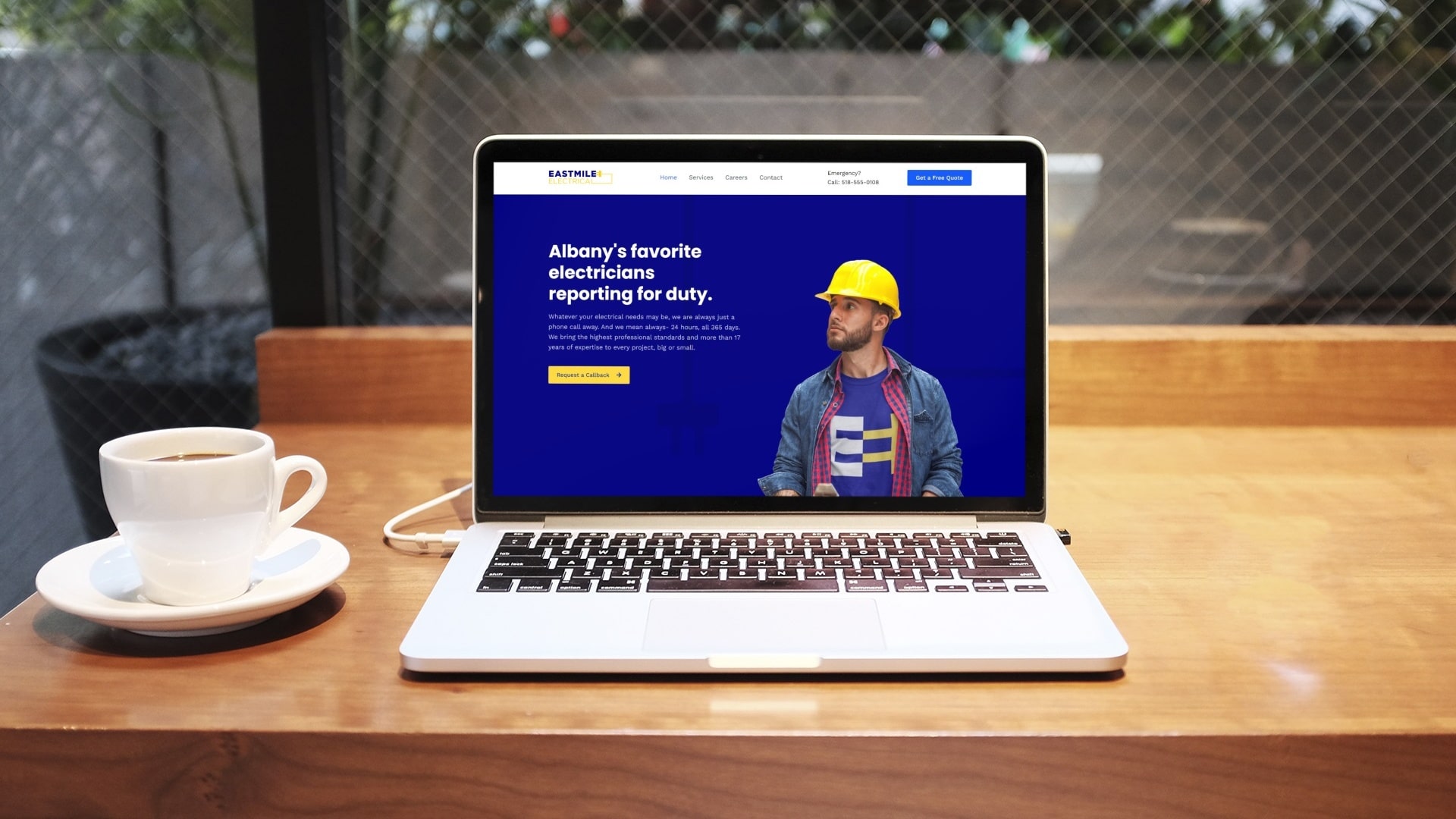
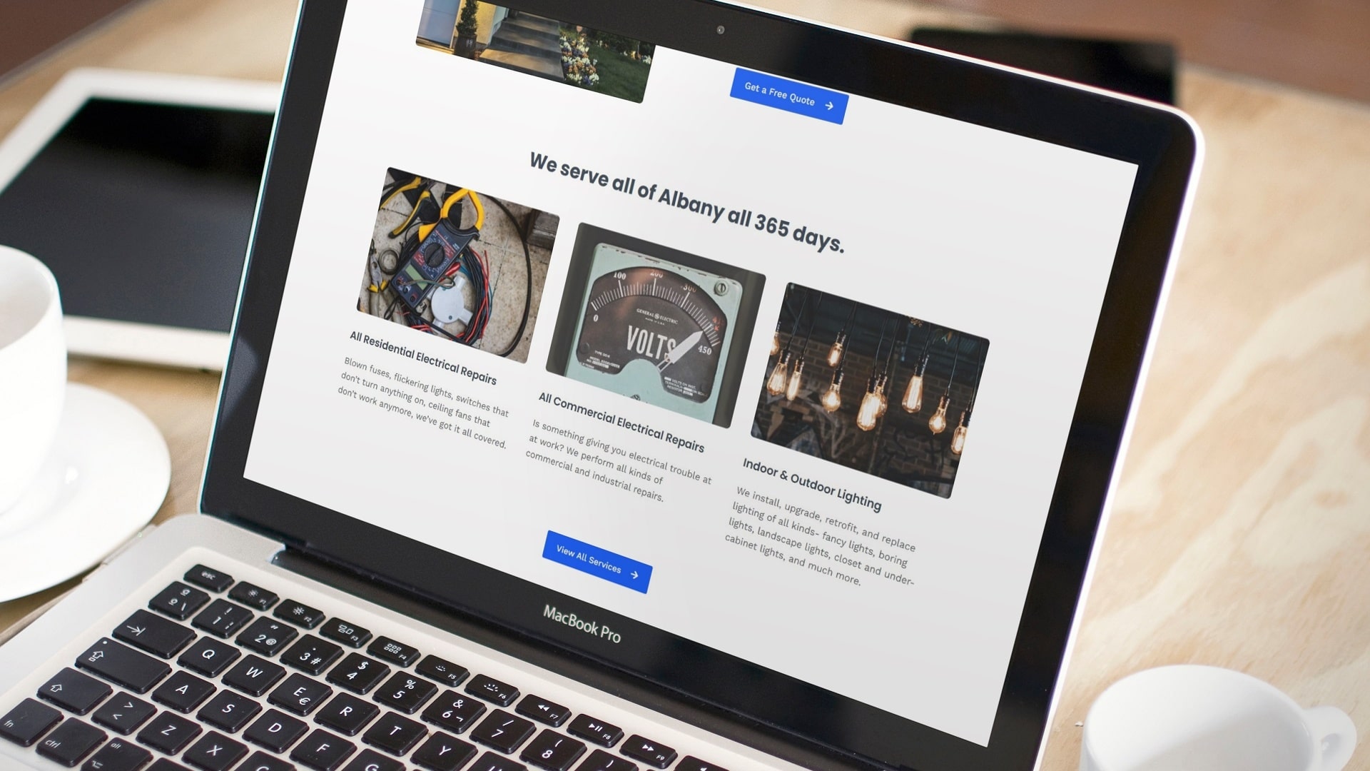
A modern website that is an extension of the brand identity
The website has five pages and sports the signature new look of the Eastmile brand. For the typography, the fun and bold Poppins is paired with medium-weight Work Sans font. The website works great on desktop computers, mobile phones, and tablets of all screen sizes. Prior to building the website, we helped the Eastmile founders purchase the domain, host the site, and set up necessary security protocols. After finishing the project we performed website performance optimizations and gave the founders tutorials on how to run the site. We also built them a custom control panel for the website to make their lives easier.
The submark sets the dimensions for the primary logo, and brings more versatility to the identity system
The plug-and-socket combo is built using the golden ratio grid to make the proportions aesthetically pleasing. This submark can fit in condensed spaces where the primary logo won’t. It can be used on its own for applications such as icons, favicons, profile pictures, small print pieces, and patterns, or in tandem with other elements of the identity system.